Sourcefour has been around since 2003, and our current logo and branding for almost half that time. So when we moved premises in the summer, we decided it was time for a fresh look. Not because we were bored or because everyone else was doing it, but because we’d evolved and our old branding wasn’t keeping up. We tackled our own branding project in exactly the same way we tackle our client projects, so we thought it would be useful to share it with you.
Step 1 – working out what we actually stand for
It can be tempting to launch straight into the design phase, but we held our horses because we knew we needed to revisit and figure out our brand proposition. What makes us different? What do we do well? Why do clients stick with us?
We didn’t just sit in a room and decide this ourselves. We asked clients and suppliers what they actually thought about working with us. We got the whole team involved to bring in different perspectives. Then Alison, our Director of Marketing, pulled it all together into a proper value proposition and messaging map.
Turns out, people like us because we’re straight-talking, we bring ideas from all over the place (not just what everyone else in their sector is doing), and we don’t waffle on with agency nonsense.
Step 2 – creating the look and feel
Once we knew what we wanted to say, Kirk, our Creative Director, got to work on how it should look.
He didn’t just look at what other agencies were doing – that’s how you end up looking like everyone else. Instead, he looked at brands from completely different sectors that captured the energy and attitude we were after. Inspiration comes from everywhere, and you need to keep your eyes open beyond your own industry.
What we kept
Not everything needed binning. Our colour palette of orange and grey still felt right for the bold statement we wanted to make, so we kept it, with some small improvements.
We are still recognised by the orange circle graphic in our old logo and it works well as an icon, so we knew we wanted to keep that circular element, but move away from the smooth and ‘scripty’ style of the old version.
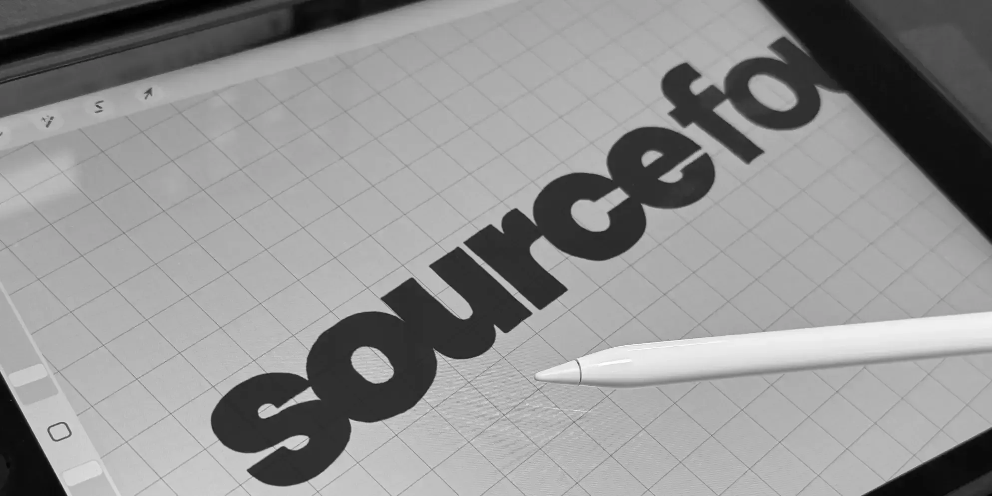
The new logo
When approaching the logo design, Kirk knew exactly where he wanted to start.
“We have been recognised by the S4 symbol in a circle device for well over a decade, and I wanted to represent the growth we have achieved in that time by ‘bursting’ out of that orange circle, with a subtle orange ‘fullstop’ moving to the end of our brand name.
We wanted to continue to use the S4 icon, but felt that it was time for the logotype to be able to stand alone without it and make a statement too.

As Kirk explained, “For the logotype we decided to combine a striking modern font and a hand-illustrated element to represent the different faces of our creative output. I experimented with hand-drawn lettering but nothing was quite right, so after selecting a bold new brand font I drew the logo from there. This gave it a slightly rough hand-drawn feel with proper punch.”
We also felt it was important to put visual emphasis on the “Source” part of our name, and achieved this by splitting Sourcefour into two parts, dropping the ‘four’ slightly lower, using a lighter-weight font. This creates movement even when the logo sits on a horizontal line.
We wanted this rebrand to really reflect the energy at Sourcefour – we have big things to say, and ideas in spades! Using the logo at a slight angle, sometimes cropping off the page edge gives the appearance that it’s bursting to get out.

The roundel
Kirk illustrated a new take on the S4 symbol for our roundel which can be used on its own or as part of the logo in various positions. This flexibility matters in logo design as it means you avoid those situations where logos end up too small, taking up too much space, or being impossible to read.
Step 3 – making it work everywhere
Branding is more than just a logo; it also includes colour, typography, image strategy and tone of voice. Joe, our photographer, took some great candid images of the team, and with all the brand elements in place, we were able to apply the branding to proposal documents, business cards, hoodies, signage, the lot. Implementing a new brand is where a huge amount of work happens, but it needs to be comprehensive and consistent across everything.
Step 4 – the new website
Our website is a major part of our marketing presence, so we couldn’t just slap a new logo on the old site and call it done.
We wanted to get the balance right between giving enough information without overwhelming people, and being visually interesting without being annoying to navigate. Agency websites can be over-complicated in an attempt to show off, but users rarely have the patience for that.
The new branding was a step change in how we present ourselves, and our old website didn’t do us justice anymore. It needed updating not just visually, but with new content and our straightforward tone of voice.
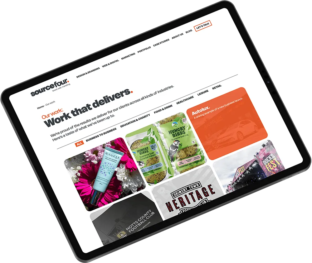
We included several key areas:
An updated portfolio where we showcase the visual work we’ve done for clients across different sectors
Case studies that let us go deeper into multi-channel campaigns or projects that don’t have as much visual punch but are still interesting
A blog where each team member can share what they know (like this one)
The start of a new era
Rob, our MD, said: “After twenty-three incredible years of growing this business, we recognised that our old branding and website didn’t quite capture the amazing work we do or the fantastic team we have. Our recent move to a new office inspired us to give our brand a fresh look. Although our core values – honest communication, creative ideas, and a no-nonsense approach- remain, our updated branding now truly showcases who we are today. We’re excited for this new chapter and can’t wait to share it.”
So yes, there’s been a lot of change at Sourcefour. But the things our clients love about us are here to stay. We’re still the same small team with big ideas and zero pretension – we just look a bit sharper now.
